


Introduction to Framing Design
Successful framing design is actually an artistic combination of several design points of view: aesthetic considerations, mechanical structure, and longevity.
The magic performed by professional framers is to find the best mix of all of these resulting in a piece that you and your friends will find pleasure in viewing for many years to come.
Here's how we take into account the aesthetic aspects of the art itself, where it will be presented, and your desires. The size, color of the frame as well as its relative to the art should bring attention to the art itself, not the frame.
We will ask you questions and listen to find out your particular tastes and the environment that the art will reside in.
The creativity and imagination of the framing designer can sometimes produce startling and pleasing results.
Finally preservation of your artwork over the years is an essential consideration. A watercolor painting's appearance will last significantly longer by being covered in glass, even though it may detract from viewing.
Sizes
Framing design considers the scale of the visual elements within a work of art as well as its overall size to suggest the appropriate matte to match to the visual intensity and the scale of the art. Strong pieces suggest substantial frames and wider mats so that the art appears to have adequate space in a frame that complements its strength.
Various works of art can range from images with lots of delicate detail to images that have a single strong visual element. Delicate artwork can be overwhelmed by frames that are too large.
Subject matter may also contribute to an artwork's measure of strength. A postcard of historical interest such as from a museum may dictate stronger framing than the travel postcard you receive from a friend. Likewise poster art may only need a simple frame.
Matte Color
Frame design customarily begins with choosing a matte color because the colors that surround your artwork have a powerful ability to bring attention to your art rather than to themselves.
Mattes provide the visual space in which your art will be displayed. Matte colors often complement the colors in your art by way of minimum contrast. For example, using a light matte on a dark image actually intensifies the dark color. Dark mattes often overwhelm lighter images. Particular art works are best presented with neutral colored mattes or intentionally contrasting colors.
A standard approach uses matte colors that coordinate with the background colors of the art. The tints and hues of the matte should harmonize your art. The matte color intensity should resemble the dominant colors of the art. In general, dark pictures need dark mattes, and lighter pictures need lighter mattes.
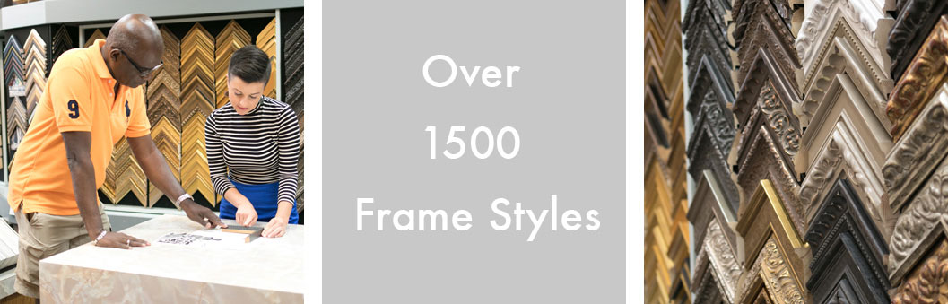
Frame Styles
The style of your art often suggests the style of frame that will be appropriate.
Some pieces lend themselves to different treatments such as a historical period piece.
The overall feel of an artwork whether it is abstract, geometric, classical, life study, portrait, landscape can be paired with an appropriate frame style. Typical examples are gilded wooden frames and angular metal frames.
Sometimes mixing styles can be very interesting as long as the framing does not detract from the artwork.
Frame and Matte Textures and Patterns
The different grains and textures of a wooden moulding influence its overall appearance. Conventionally rough-grained wood frames are often suited for casual, outdoorsy pictures, whereas the feel of the clean texture of a maple frame works better with more formal or modern art.
Additionally matte textures can make either a more dramatic or subtle transition between the art and frame.
Patterns in the art occasionally can be mirrored in the frame design for a noticeable effect. An artwork depicting a building with a striking architectural element can suggest frame with a similar pattern to integrate the whole.
Strongly patterned frames must be used with care because of their dramatic effect. The remedy for falling in love with a particular frame that will not complement your art is to use it for framing a mirror in your living environment.